Hi, I’m Jess!
Thoughtful websites built to grow with you.
Whether you’re a brand in bloom, a nonprofit with a mission, or a business ready to scale — I’ll help you tell your story, solve your tech headaches, and build something you’re proud to show off.
View My Work
Starting Over
Website Rebuild
full rebuild
not-for-profit
video library
membership

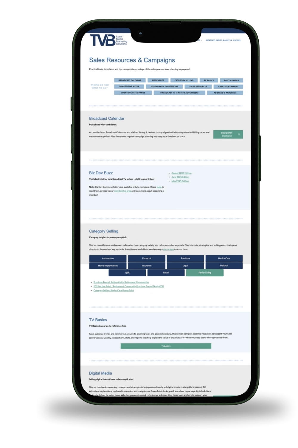
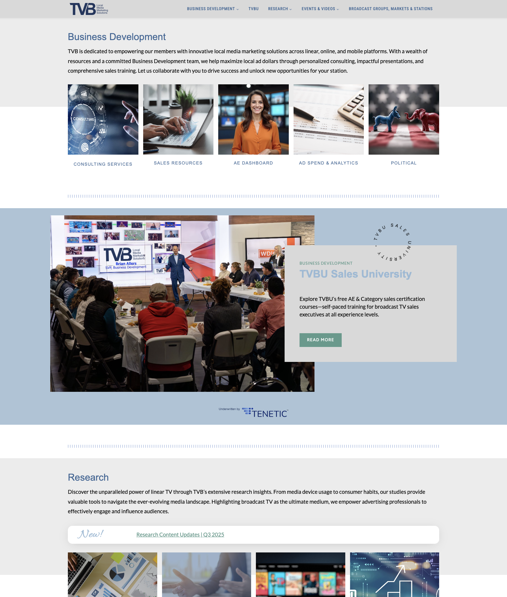
TVB came to me with a common problem: a site weighed down by outdated Elementor builds, slow load times, and a frustrating editor experience. I rebuilt everything from the ground up using a modern WordPress block theme (Kadence + Restored316), giving them a site that’s not just beautiful, but blazing fast, mobile-friendly, and intuitive to manage.
The result?
- Faster load times and improved Core Web Vitals
- Clean, responsive layouts across all devices
- An editing experience even non-tech team members love
“We moved from design and tech debt to a sleek, easy-to-navigate experience.”
TVB isn’t just a marketing site, it’s a robust membership-based platform with complex moving parts under the hood. From CRM syncing to gated content and video libraries, this project required custom integration work across multiple tools and systems.
Key integrations included:
- Zoho CRM (connected via custom plugin + WP Fusion)
- MemberPress for gated content and member access
- A custom Vimeo video showcase plugin (shortcode-driven and dynamically fed from Vimeo showcases)
- Additional systems: Events Calendar, LearnDash LMS, and more
I conducted a full plugin and systems audit, stripped away unnecessary bloat, and rebuilt the integrations to be stable, streamlined, and scalable—without disrupting the client’s workflow or content. Every system now works together behind the scenes to support TVB’s core mission.
TVB’s internal video platform, TVBU, housed many educational and promotional videos, but the previous system buried them in hard-to-navigate pages. I led a full UX overhaul to turn the archive into a highly searchable, modern learning center.
- Made it simple for staff to manage new video content without touching code
- Integrated a custom shortcode plugin powered by a Vimeo API for seamless syncing
- Designed a filterable video grid with intuitive tagging and categorization
TVB’s previous site was cluttered and full of dead-ends. I led a full UX audit and rebuilt key page structures so users could:
- Access all core content in 3 clicks or less
- Quickly navigate between categories
- Understand TVB’s offerings at a glance
“It finally feels like a real website, not a junk drawer.”
Personal Blog
Personal Blog
Brand refresh
Recipe index
raptive ads
story driven design
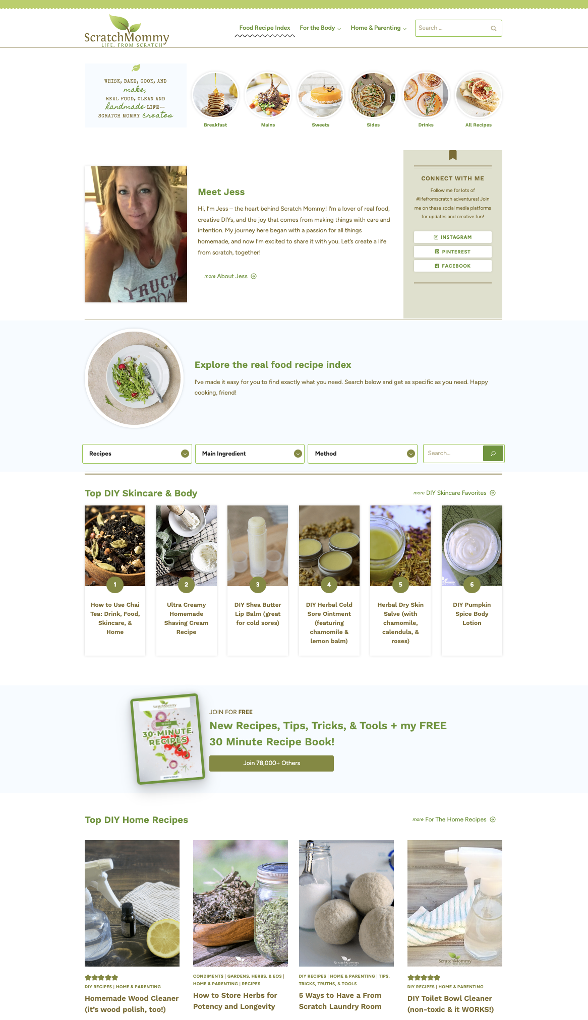
I founded Scratch Mommy in 2013 as a personal passion project. I had zero web experience, a two-year-old at home, and a strong desire to share my “life from scratch” …from homemade skincare to real food recipes to DIY solutions for everyday living.
With nothing but curiosity and grit, I locked myself in my office one weekend and launched the first version of Scratch Mommy. Over the years, I’ve rebuilt and refreshed the site several times, each version reflecting a new stage in my life and business.
In 2024, I launched the most powerful version yet.
The result?
- A cleaner, modern layout that highlights my most popular recipes and DIYs
- Significantly faster load times and improved user experience
- Enhanced SEO structure and stronger brand consistency across content
- A fully redesigned homepage, recipe index, and blog layout
“This was the first website I ever built. It’s wild to look back and see how far it—and I—have come.”
The latest rebuild wasn’t just a visual upgrade… it was a full content and UX audit. I refined my categories, implemented a better tag system, and redesigned my homepage to reflect current content goals and traffic patterns.
Key features included:
- Accessibility and contrast issues resolved throughout the site
- Customized WordPress blocks to reduce plugin dependency
- A clean, mobile-first Kadence theme (Restored316 child theme)
- Category and tag structure rebuilt from scratch for UX and SEO
- Featured image and ad layout optimized for Raptive
- Improved recipe card formatting and internal linking
The Scratch Mommy brand has always been about simplicity, transparency, and authenticity. With this rebuild, I was able to modernize the look and feel of the site while preserving the warmth and homemade charm that readers have loved since 2013.
“I built it all myself—again—and it finally feels like home.”
Growing Business
Brand New Site
Full build
Custom branding
sleek one-pager
Modern Identity
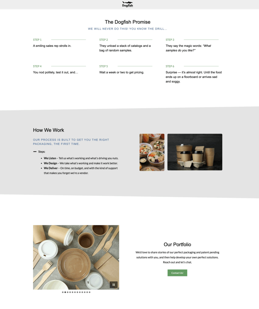
Dogfish Packaging had no website… just a domain and a lonely “Contact Us” page for months. When the client (my husband!) finally handed me some rough ideas and content, I brought the brand to life. From layout and voice to design and build, I created everything from scratch using Kadence + a Restored316 theme.
This project showcases what’s possible when starting with nothing but a business name and a vision.
Tech stack: WordPress, Kadence, Restored316 theme, Kadence Blocks.
- Guided and finalized the color palette, fonts, and brand voice
- Wrote, edited, and formatted the on-page content
- Sourced and stylized imagery to match the vibe
- Built the site from scratch using custom layout blocks
- Managed all domain and WordPress hosting connections
- Delivered the final site in under a week once content was ready
- Designed as a long-scroll one-pager for smooth user flow
- Lean, bold, and uncluttered layout tailored for B2B appeal
- Used scroll-triggered animation and image fly-ins for a modern, dynamic experience
- Integrated badges and content sections that match his packaging ethos: custom, clean, and no fluff
This site mirrors the brand personality of Dogfish Packaging: confident, innovative, and clean. With a nod to sustainability and a no-nonsense custom packaging ethos, the site is proof that a one-pager can still pack a punch.
Professional Portfolio
Brand New Portfolio
Content Strategy
Custom Design
Full Build
Personal Branding

Gavin Healey had decades of scholarship, teaching, curatorial work, publications, and projects, but no dedicated online home to bring it all together.
I built a completely new WordPress site designed to turn that extensive body of work into a clear, engaging professional presence. The goal wasn’t simply to put his CV online. It was to create a site that feels distinctly him… scholarly and credible, but creative, unconventional, and deeply connected to the work he does.
The result?
- A cohesive professional home for his scholarship, publications, curation, lectures, and upcoming projects
- Clear navigation through a large body of academic work
- A distinctive visual identity that moves beyond the traditional academic website
- Responsive, accessible layouts built for desktop and mobile
- Foundational SEO throughout the site
- A flexible WordPress structure that can grow alongside his work
A long academic CV can become overwhelming quickly. One of the biggest challenges of this project was deciding what belonged where, and creating clear pathways for visitors who may be looking for very different things.
I organized the site around dedicated areas for his CV, publications, curation, lectures and speaking, and upcoming projects, while using intentional cross-linking and calls to action to encourage visitors to explore beyond a single page.
Key features included:
- Custom publication and professional-work layouts
- Dedicated curation and speaking sections
- Downloadable CV access
- Strategic internal linking between related work
- Calls to action for speaking and collaboration opportunities
- SEO titles, descriptions, and page structure throughout
- A flexible framework for adding future publications, exhibitions, and projects
- Designed as a long-scroll one-pager for smooth user flow
- Lean, bold, and uncluttered layout tailored for B2B appeal
- Used scroll-triggered animation and image fly-ins for a modern, dynamic experience
- Integrated badges and content sections that match his packaging ethos: custom, clean, and no fluff
Academic websites don’t have to look academic.
This site balances credibility with personality, giving Gavin a professional platform that represents not only what he’s accomplished, but who he is and where his work is going next. It’s polished, unconventional, thoughtful, and built to evolve right alongside him.